RIPTA Bus Stop Redesign
In a sentence...
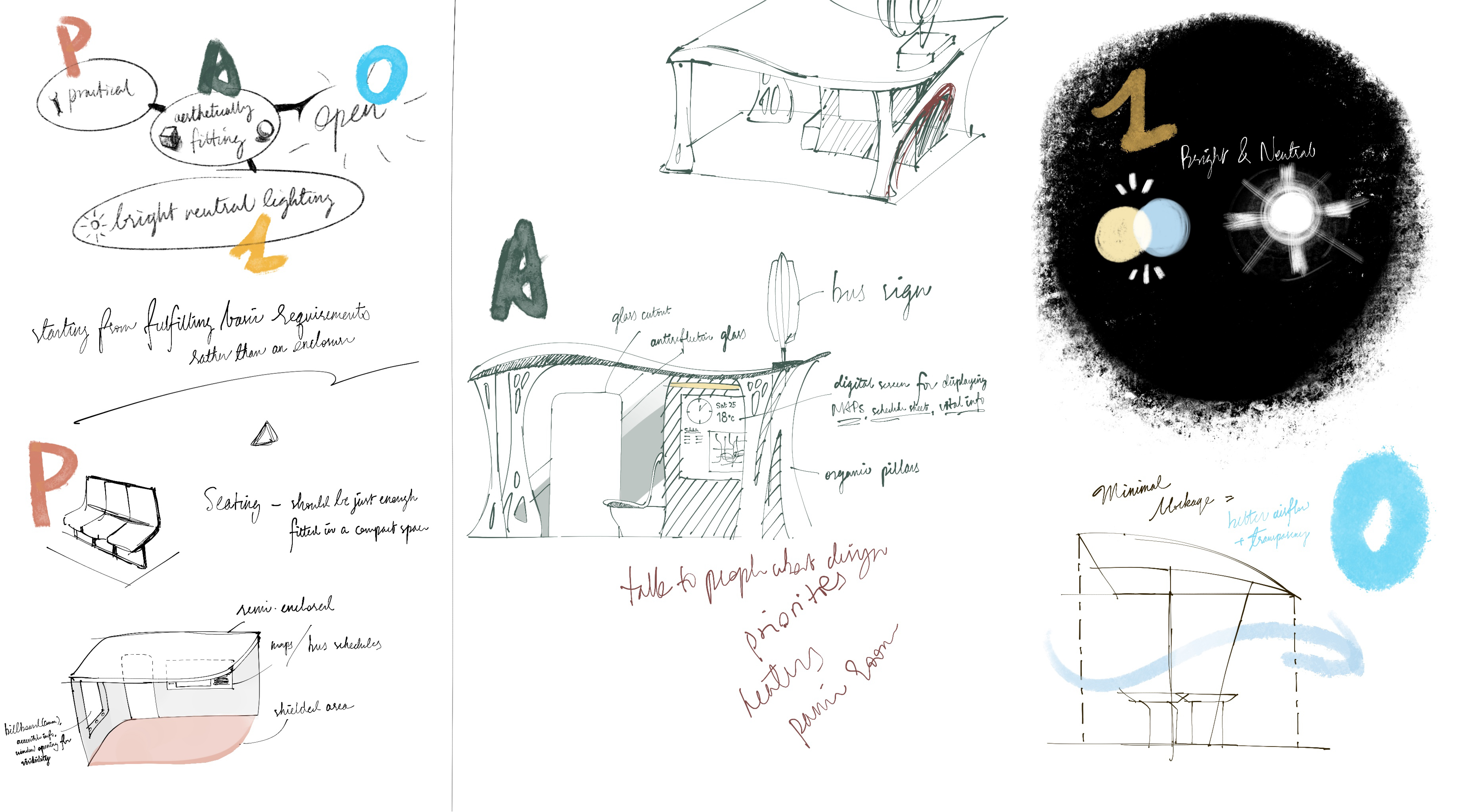
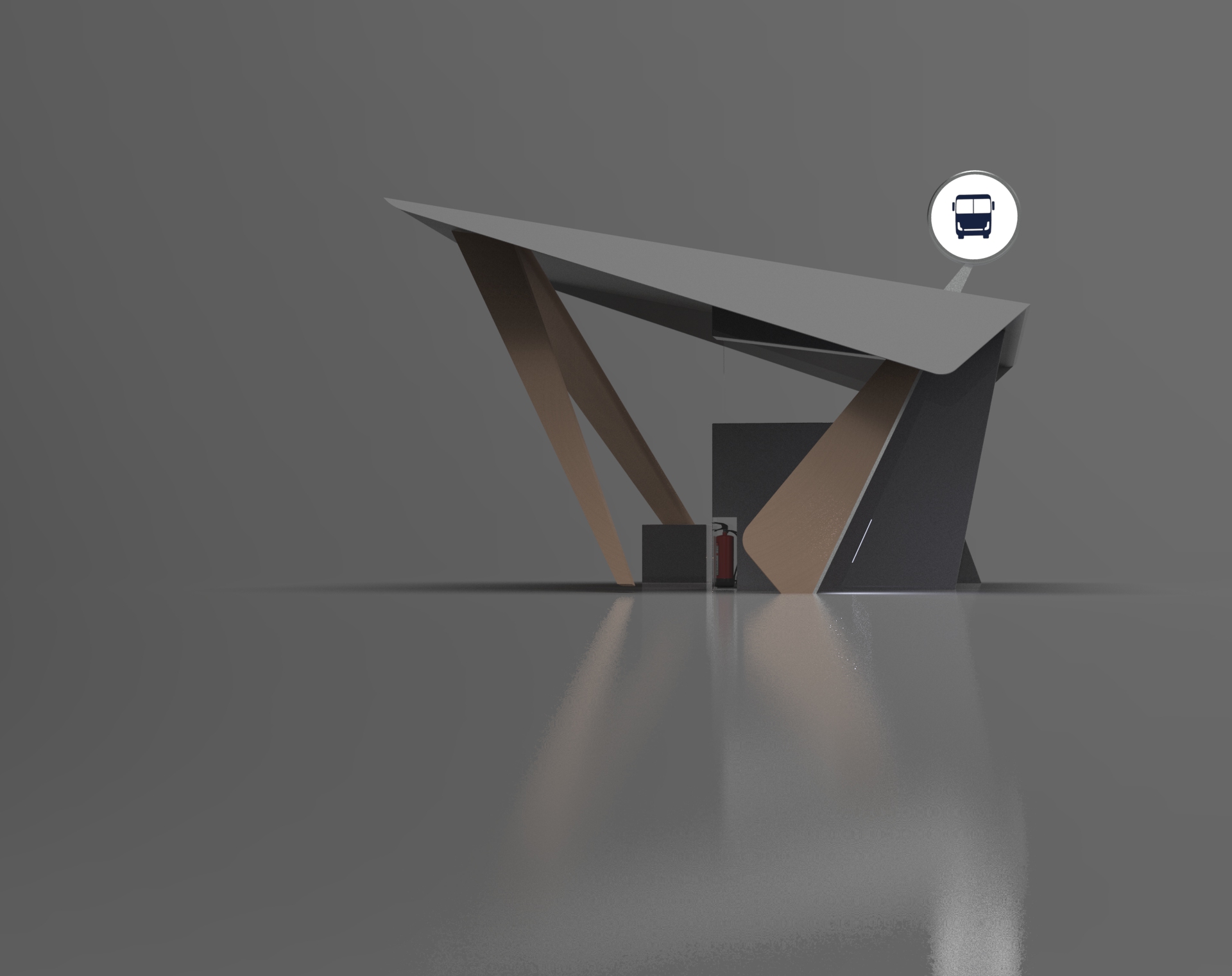
Practical, aesthetic, open and safe - a modern bus station tailor-designed for Rhode Island commuters.
Practical, aesthetic, open and safe - a modern bus station tailor-designed for Rhode Island commuters.

Build
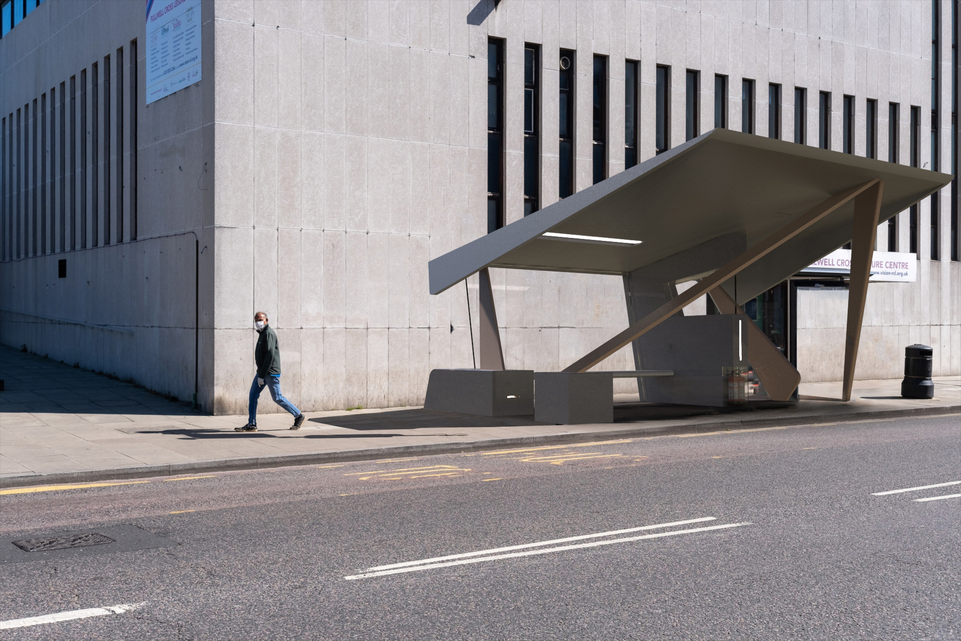
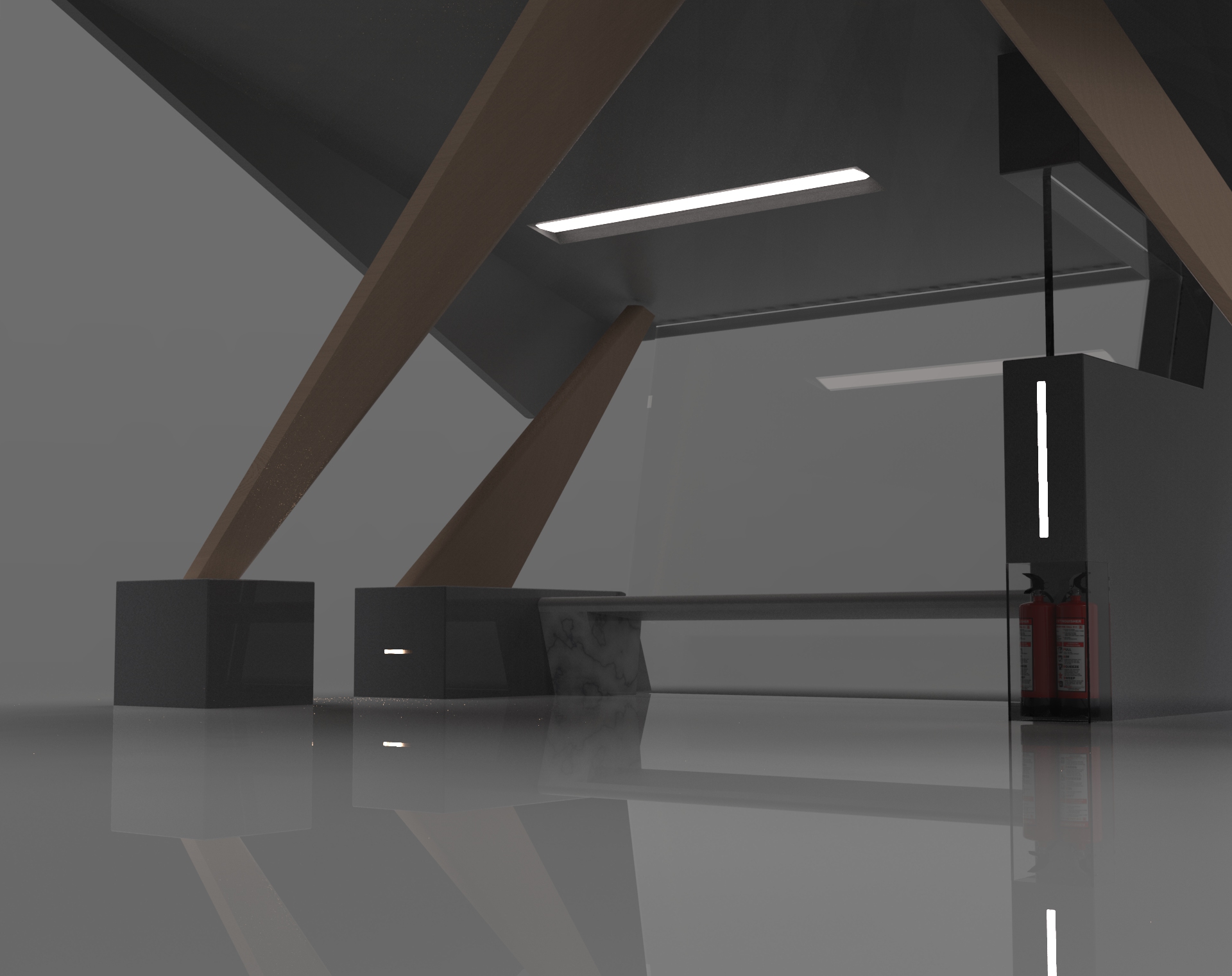
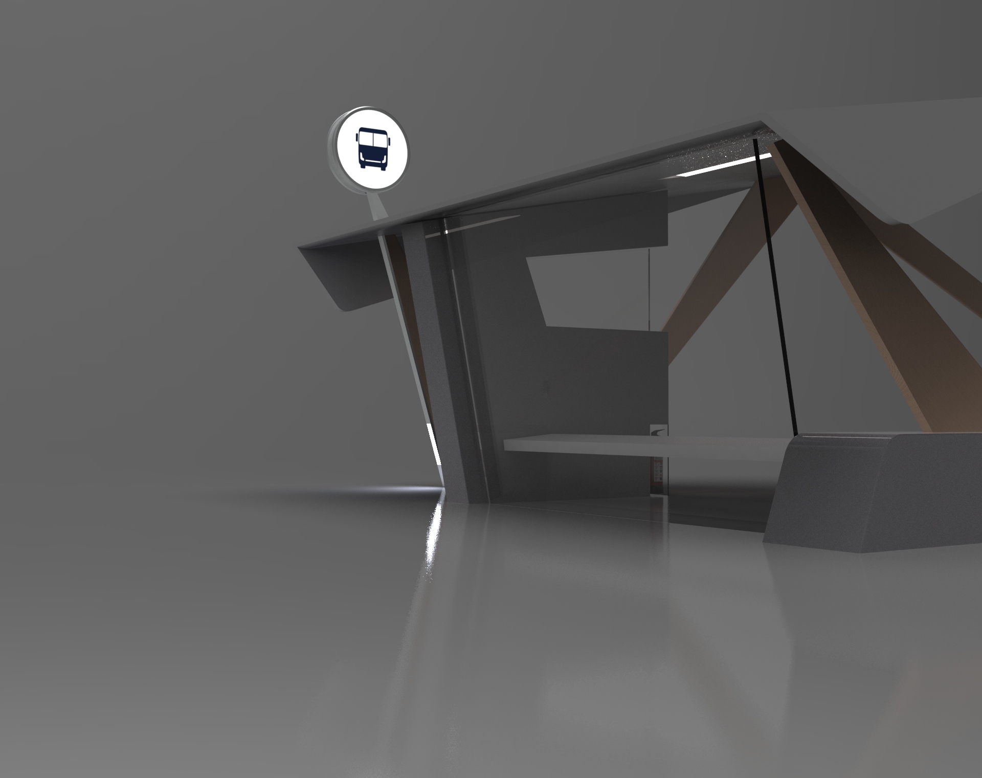
The building materials I’ve selected for this design are easy to source and relatively inexpensive. Limestone for the base and central load-bearing wall, aluminum alloy support beams in a refreshing maple finish, and a lightweight polycarbonate roof.
The Sign
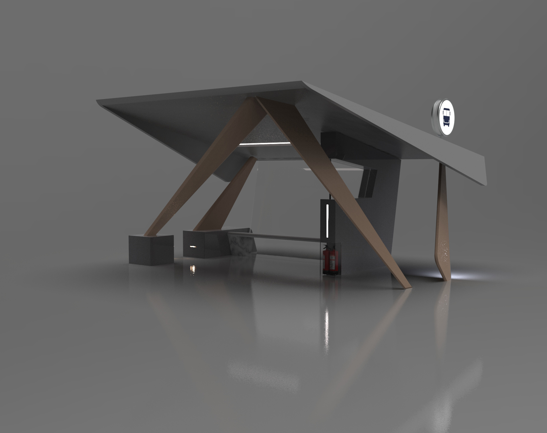
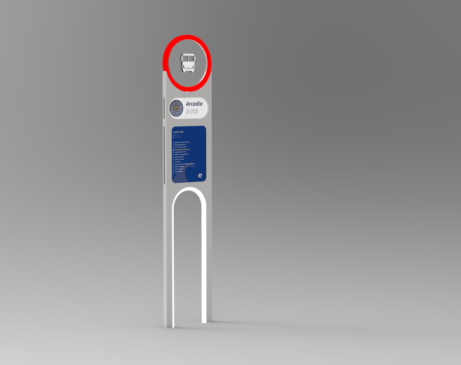
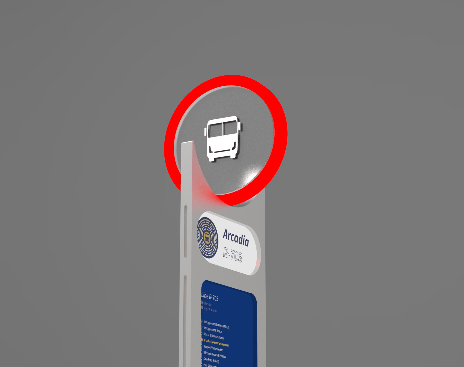
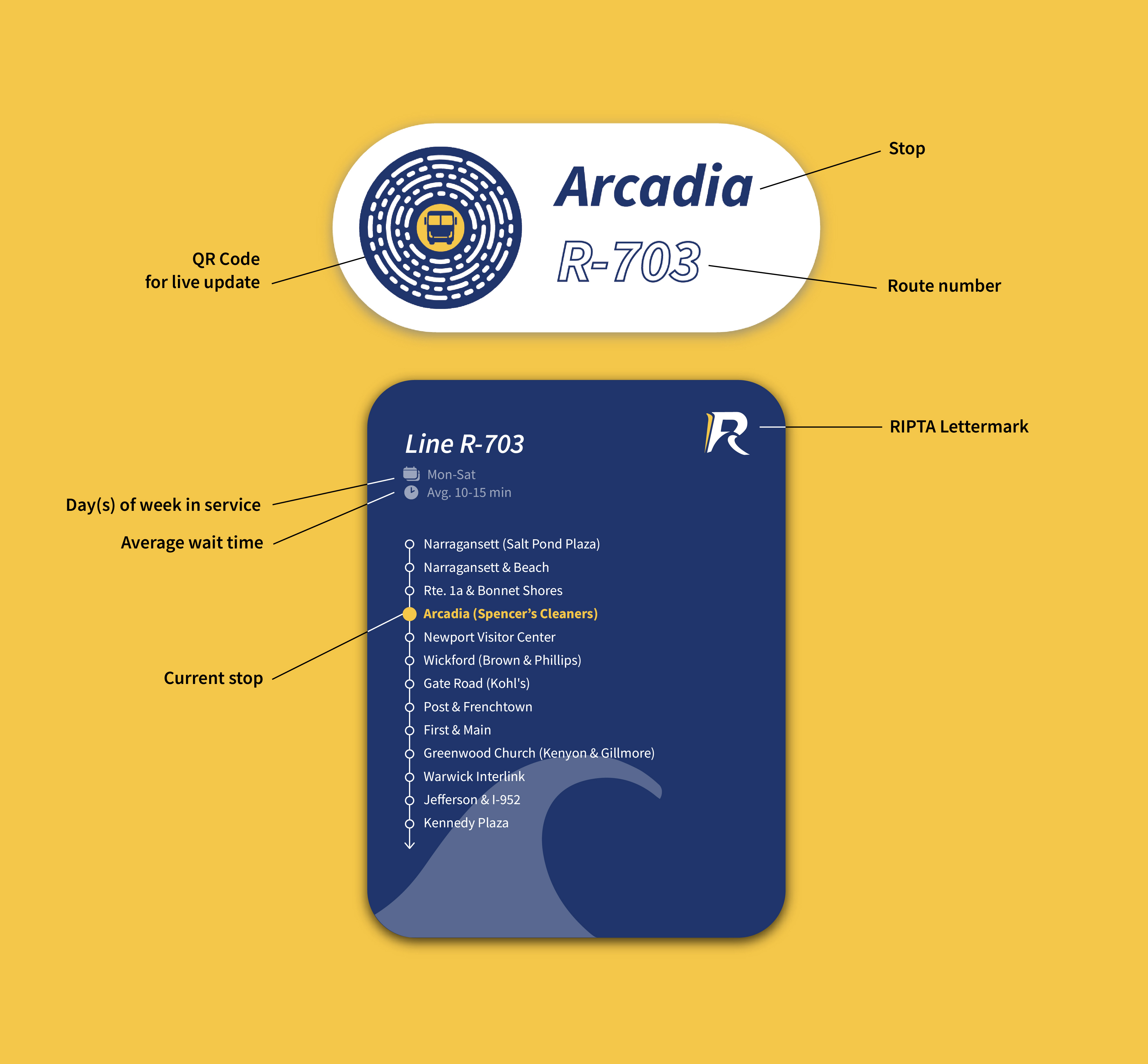
Not enough space for a full-blown station? No worries - here’s a versatile bus sign to cope with the complex terrain of Rhode Island - and provide necessary info even in the most remote locations. It is also illuminated so commuters can spot it from blocks away, even in poorly-lit conditions.
Refreshed design language
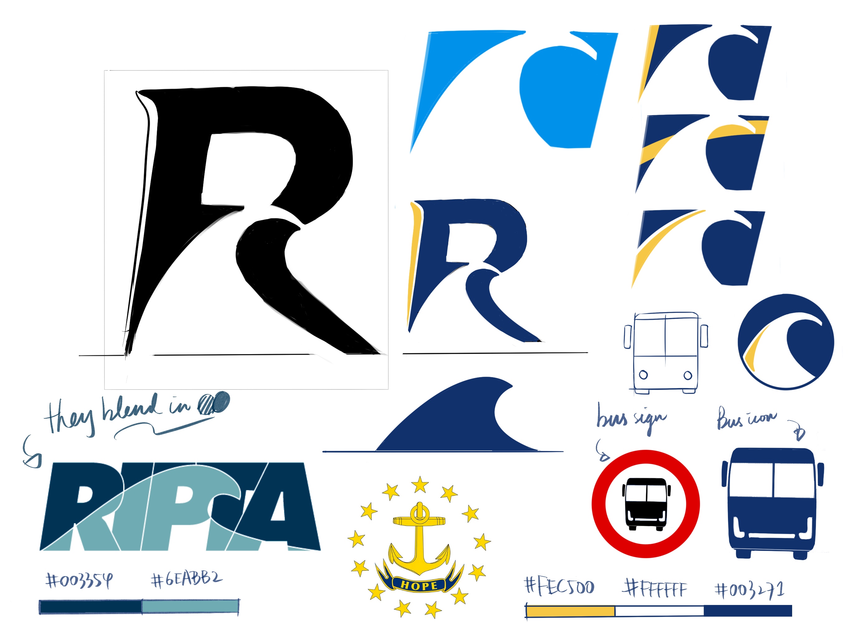
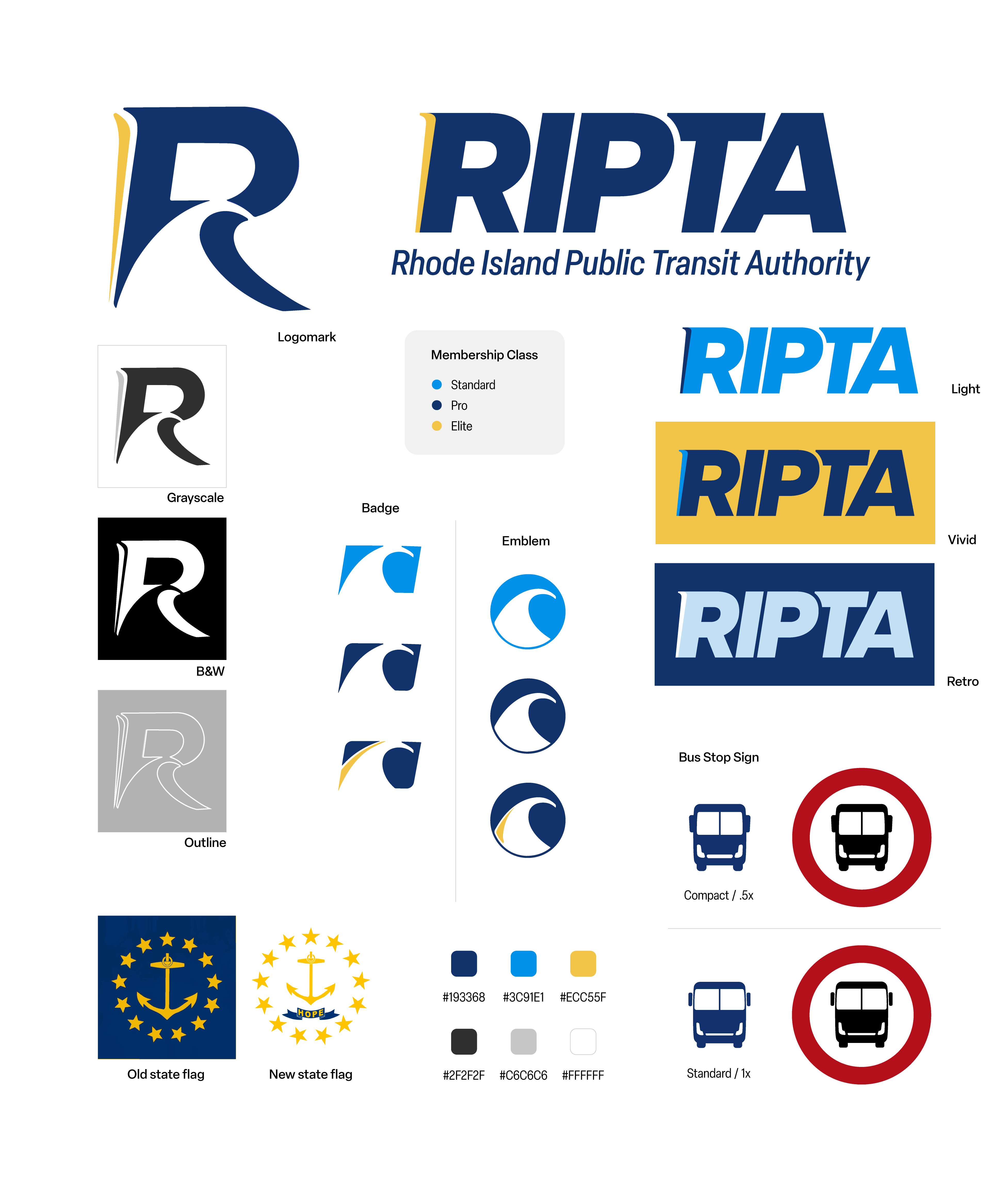
The new color theme is inspired by the renowned Rhode Island state flag in tribute to the state’s small but rich and diverse culture.
The wave incorporated in the logomark and the emblems is of course another universally recognized state symbol, as seen in license plates as well as the current RIPTA logo. It has now been adapted into a single letter in order to be displayed in tighter, more challenging spaces.
Process Sketches
